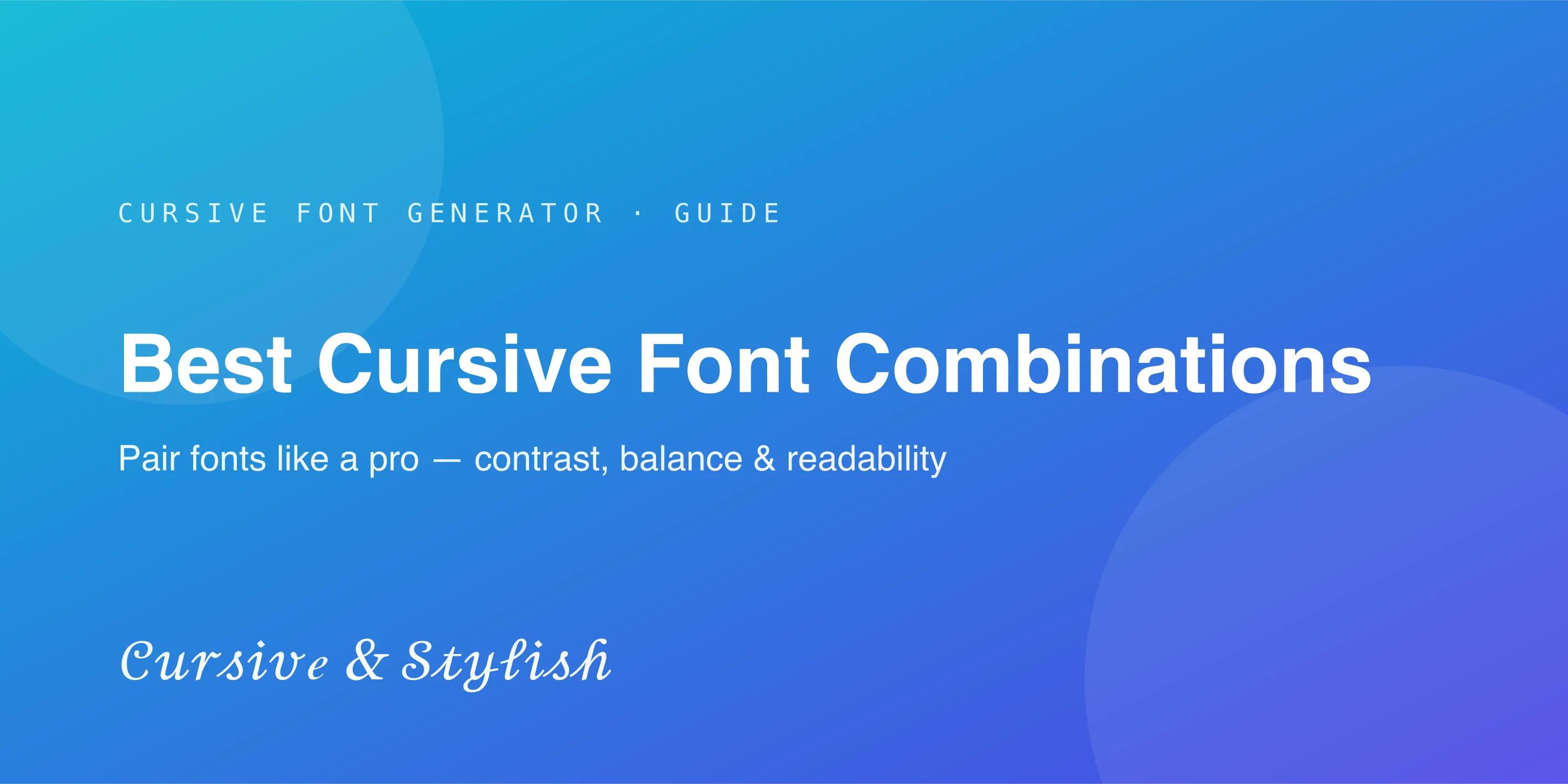
Best Cursive Font Combinations: Pair Fonts Like a Pro
Want fonts that actually work together? Discover the best cursive font combinations for logos, social media and invitations — plus a quick cheat sheet.
A beautiful cursive font can make a design look attractive, but choosing the right font to pair with it is what creates a polished and professional result. One font usually cannot do everything on its own, so combining fonts correctly helps create better balance, structure, and readability.
The right font combination can also change the overall feeling of a design. A cursive font paired with a clean sans-serif can look modern and simple, while pairing it with a serif font can create a more elegant and classic appearance. In this guide, you'll learn how to pair cursive fonts effectively and choose combinations that work for different projects. Generate your cursive headline first with the free cursive font generator, then follow the pairing rules below.
Why Font Pairing Matters More Than Most People Think
How Fonts Create First Impressions
Before anyone reads the actual words, the fonts used in a design already communicate a feeling — elegant, playful, modern, or traditional. Font pairing shapes that first impression even further by adding contrast and structure.
Why One Beautiful Font Is Not Always Enough
A single cursive font might look stunning in a headline, but it's rarely practical for body text, captions, or smaller details. A second, more functional font is usually needed to keep the rest of the design clear and readable.
How Font Pairing Affects Readability and Style
The right pairing balances personality with practicality — one font carries the style and emotion, while the other ensures the design stays easy to read and navigate.
Understanding the Basic Rule of Font Pairing
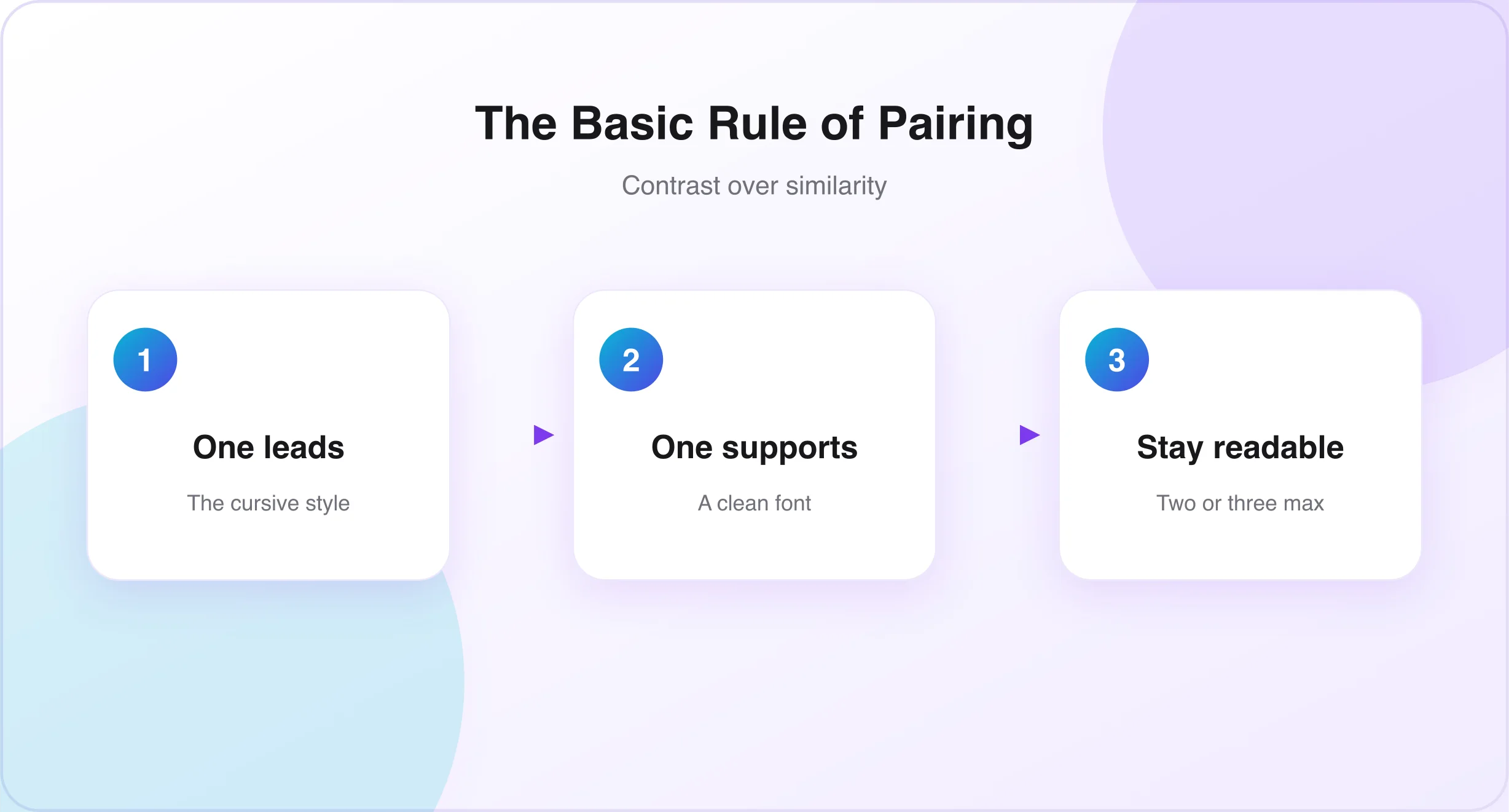
- Contrast creates better design. Strong pairings rely on contrast — a decorative, flowing cursive font with a clean, simple font creates balance instead of competition.
- Why similar fonts often clash. Pairing two fonts that look too similar, such as two different cursive styles, often creates visual confusion rather than harmony.
- The balance between personality and readability. A good pairing lets the cursive font express personality, while the second font handles clarity and function.
The Main Font Types That Pair Well With Cursive Fonts
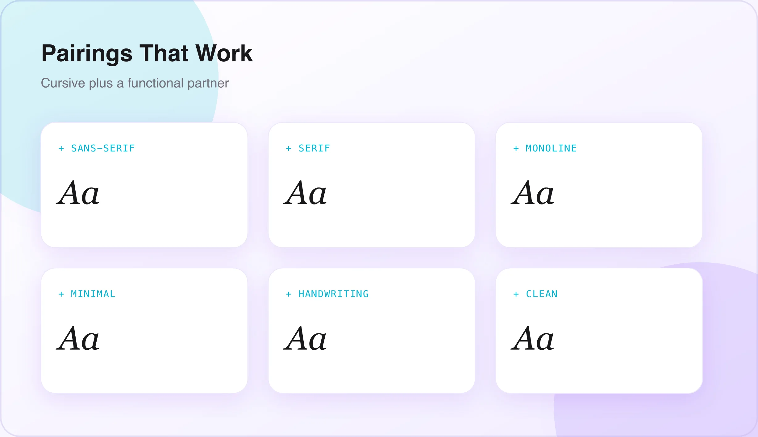
- Serif fonts bring structure and tradition, making them a strong match for elegant or formal cursive styles.
- Sans-serif fonts are clean and modern, pairing well with cursive when a design needs a contemporary, balanced look.
- Monoline fonts have consistent stroke thickness, offering a simple, modern contrast to more decorative cursive styles.
- Minimal fonts keep designs clean and uncluttered, allowing a cursive font to remain the visual focal point.
- Handwriting fonts can add extra warmth and authenticity, especially for personal or artisan projects.
For more experimental pairings, a touch of glitch text or small caps can add contrast beneath a cursive headline without competing with it — useful when you want a secondary line to feel intentional rather than decorative.
Best Cursive Font Combinations for Different Projects
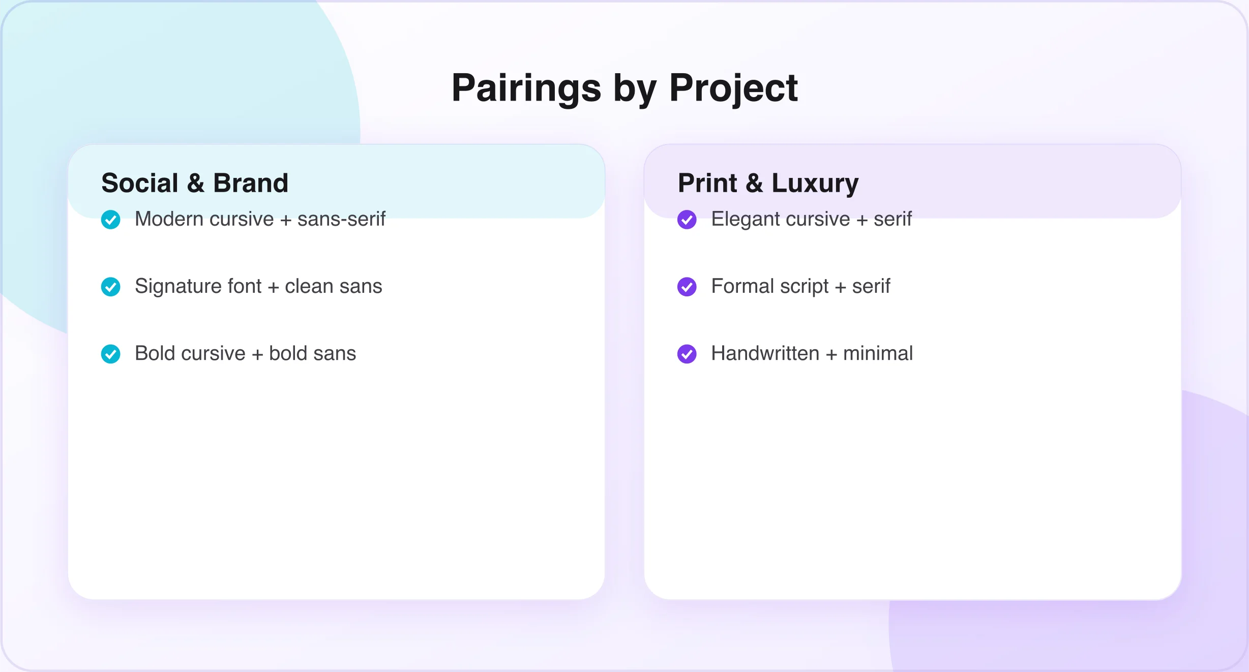
- Cursive + sans-serif for modern branding — balances the elegance of cursive with the clarity of sans-serif; popular for contemporary brand identities.
- Cursive + serif for elegant designs — creates a refined, traditional feel, often used in luxury branding and formal invitations.
- Cursive + monoline fonts for minimal designs — keeps designs clean and modern while preserving a flowing personality.
- Cursive + handwritten fonts for creative projects — pairing two complementary handwritten styles adds depth and authenticity.
- Cursive + clean fonts for social media graphics — ensures the design stays both eye-catching and easy to understand at a glance.
Best Font Pairings for Social Media Content
- Instagram quotes and story designs — a bold cursive headline paired with a clean sans-serif for supporting text. (Style your headline with the Instagram Font Generator.)
- YouTube thumbnails — a strong cursive or brush font paired with a bold sans-serif creates contrast that remains readable at small sizes.
- Pinterest graphics — elegant cursive titles paired with simple fonts for descriptions feel polished and clickable.
- Personal branding content — a signature-style cursive font paired with a clean sans-serif feels professional and personable.
Best Font Pairings for Business and Branding
- Luxury brand logos — elegant cursive or calligraphy fonts paired with a classic serif convey sophistication and prestige.
- Small business packaging — a handwritten or brush cursive font paired with a minimal font gives an authentic, crafted feel.
- Beauty and fashion branding — soft, flowing cursive fonts paired with clean sans-serif fonts create a feminine, modern aesthetic.
- Photography and creative businesses — signature-style cursive fonts paired with simple sans-serif fonts work well for watermarks and branding.
Best Cursive Font Combinations for Print Designs
- Wedding invitations — formal script paired with a classic serif creates a timeless, elegant combination.
- Greeting cards — soft handwritten cursive paired with a simple, readable font keeps cards warm and personal.
- Posters and flyers — bold cursive or brush fonts paired with strong sans-serif fonts stand out while remaining readable from a distance.
- Product labels and packaging — handwritten or brush cursive fonts paired with minimal fonts give a crafted, authentic appearance.
How Emotional Tone Changes Font Pairing Choices
- Elegant and premium — refined cursive or calligraphy with classic serif.
- Warm and personal — soft, slightly imperfect cursive with simple fonts.
- Fun and playful — bold, decorative cursive with rounded sans-serif.
- Bold and modern — strong brush cursive with geometric sans-serif.
- Romantic and soft — delicate script with light, simple fonts.
Common Font Pairing Mistakes Designers Make
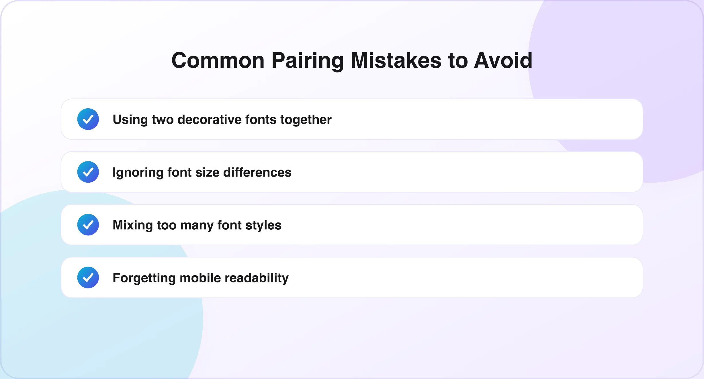
- Using two decorative fonts together creates visual competition instead of balance.
- Ignoring font size differences can make one font overpower the other.
- Mixing too many font styles — more than two or three in a single design looks cluttered.
- Choosing style over readability hurts the overall effectiveness of a design.
- Forgetting mobile readability — always test pairings on smaller screens.
Quick Font Pairing Cheat Sheet
| Project Type | Recommended Font Combination |
|---|---|
| Luxury logo | Elegant cursive + serif |
| Social media post | Modern cursive + sans-serif |
| Wedding invitation | Formal script + serif |
| Product packaging | Handwritten cursive + minimal font |
| Personal brand | Signature font + clean sans-serif |
How to Test Font Combinations Before Finalizing
- View designs on multiple screen sizes to ensure consistency across desktop and mobile.
- Test small and large text sizes to confirm both headlines and supporting text stay readable.
- Check readability from a distance for printed materials like posters and packaging.
- Compare multiple pairings side by side to identify which feels the most balanced.
Frequently Asked Questions
How many fonts should I use in one design? Most designs work best with two to three fonts — one for visual impact and one or two for supporting text and structure.
Which fonts pair best with cursive fonts? Sans-serif, serif, and minimal fonts generally pair best, since they provide clear contrast and improve readability.
Can I use two cursive fonts together? It's possible, but choose two cursive styles that differ enough in weight or structure to avoid visual clashing.
Why does my font combination feel unbalanced? This often happens when two fonts are too similar in style, or when size and spacing haven't been adjusted between them.
Which font pairing works best for social media? A modern cursive font paired with a clean sans-serif tends to work best — stylish while remaining easy to read quickly.
Conclusion
Pairing fonts effectively comes down to a few key principles: choosing contrast over similarity, letting one font lead while the other supports, and always prioritizing readability alongside style. A well-chosen cursive font combination can transform a design from simply decorative to genuinely professional.
By applying the pairing rules, project-specific combinations, and testing methods covered in this guide, you can confidently create font pairings that feel balanced and intentional. Start by generating your cursive headline with the cursive font generator, then learn how to choose the right cursive style for your project. If you're new to Unicode-based text tools, our guide on whether a cursive font generator is safe explains exactly how the underlying text works.

Written & reviewed by
Daragh Boland
Editor & Typography Specialist
Daragh Boland is the editor of Cursive Font Generator, writing about Unicode text, font pairing and stylish fonts across social platforms.
Connect with Daragh on Facebook →