Cursive, Script & Handwriting Fonts: Key Differences
Confused about cursive, script and handwriting fonts? Learn the key differences, real use cases and simple tips to choose the right font style.
When you search for handwritten fonts, you'll often see names like cursive, script, handwriting, and calligraphy. Many of them may look similar at first, which can make it difficult to understand the differences between each style.
However, these font styles are not exactly the same. Each one has its own appearance, purpose, and best use. In this guide, you'll learn the key differences between them, when to use each type, and how to choose the right font for your project. (To generate copy-paste cursive text right away, use the free cursive font generator. If you're wondering whether these Unicode-based tools are safe to use, see is a cursive font generator safe?)
Why Understanding These Font Differences Matters
The Problem With Using These Terms Interchangeably
Most people use "cursive," "script," and "handwriting" as if they're the same word. They aren't. They look similar, but each one works differently. Pick the wrong style, and a wedding invitation looks casual instead of elegant, a children's book cover looks too fancy instead of playful, a business logo looks too personal instead of authoritative, and a social media post looks amateur instead of creative. The gap between a strong design and a weak one often comes down to choosing the right font type for the job.
The One-Line Summary Before We Begin
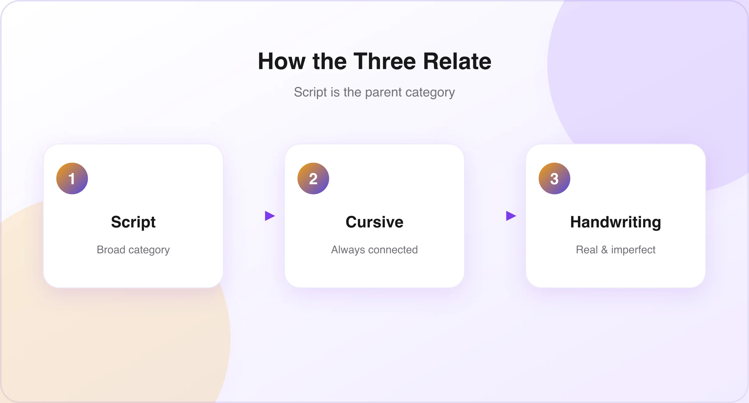
Here's the simplest way to understand the three terms: Script is the broad category for any font that looks handwritten or hand-lettered. Cursive is a type of script where every letter connects to the next. Handwriting fonts are the loosest category — built to look like real, imperfect human writing, with uneven spacing and natural quirks.
Picture three circles. Script is the largest. Cursive sits fully inside it. Handwriting overlaps both, but also stands partly on its own.
What Is a Script Font?
Script fonts copy the flow and elegance of handwriting or calligraphy. They mimic the strokes of a pen or brush, often with connected letters and smooth lines that feel graceful and refined. The style dates back to the 18th century, when it gave documents, certificates, and seals an official look. In typography, "script" describes any typeface built to imitate handwriting — it's the parent category, and cursive, calligraphy, brush, and handwriting fonts all sit underneath it.
Key Visual Characteristics of Script Fonts
- Flowing, pen-like letters
- Thick downstrokes paired with thin upstrokes
- Decorative flourishes at the start or end of letters (called swashes)
- Letters that may or may not connect
- An overall feeling of elegance or artistry
The Two Main Types of Script Fonts
Formal scripts take inspiration from 18th-century copperplate writing. They're the most traditional and refined, with strong stroke contrast, ornate capitals, and a clear right slant — think wedding invitations, diplomas, and luxury logos. Casual scripts draw from brush lettering and modern, informal handwriting. They feel relaxed and current, with softer stroke contrast and looser letterforms.
When to Use Script Fonts
Script fonts shine in short bursts: headlines, logos, invitations, and labels. Good for: wedding and event invitations, brand logos and signatures, luxury or artisan packaging, greeting card headlines, social media headers and bios, romantic or literary book covers, and restaurant menus. Avoid them for: long paragraphs, all-caps text, very small sizes, and technical or clinical documents.
What Is a Cursive Font?
Cursive fonts connect every letter to the next, so the text looks handwritten rather than typed. Cursive writing comes from the Latin word currere, meaning "to run." It was designed to make writing faster and smoother than print, where each letter stands alone. The defining trait is simple: if every letter joins the next without a break, it's cursive.
How Cursive Fonts Relate to Script Fonts
Cursive fonts are a type of script font, but with one strict rule. All cursive fonts are script fonts. Not every script font is cursive. Script is the category; cursive is a type within it, defined by connected letters. A script font can have disconnected letters — that font isn't cursive. A cursive font can never have disconnected letters.
Key Visual Characteristics of Cursive Fonts
- Connected letters with no gaps
- A consistent slant, usually to the right
- Loops above and below the baseline on many lowercase letters
- Smooth transitions with no abrupt stops
- A continuous rhythm, so words read as one flowing unit
When to Use Cursive Fonts
Cursive works best when a design needs a personal touch — business cards, signature-style logos, and handwritten greeting cards. Good for: personal signature logos, business cards for creative professionals, names on greeting cards, wedding vow booklets, personalized gifts, feminine brand identities, and Instagram bios and copy-paste text styling. Avoid it for: corporate branding that needs authority, technical documentation, and interface text.
What Is a Handwriting Font?
Handwriting fonts are built from real writing — pen, pencil, chalk, or brush. They keep the natural quirks of real handwriting instead of smoothing them out. Unlike script fonts, which are usually polished and stylized, handwriting fonts embrace imperfection: uneven baselines, irregular spacing, and playful curves give them charm and individuality. The key idea is imperfection, used on purpose.
The Subtypes Within Handwriting Fonts
- Print handwriting — letters stand alone instead of connecting; easier to read than cursive styles.
- Signature fonts — built to mimic a person's natural signature; usually cursive in structure.
- Chalk fonts — designed to look written on a chalkboard, complete with dust and texture.
- Monoline handwriting — every stroke stays the same thickness, giving a clean, vintage look.
- Brush handwriting — built to look like lettering from a brush pen, with varied stroke width and energetic movement.
When to Use Handwriting Fonts
Handwriting fonts work best when you want a design to feel personal and handcrafted. Good for: children's books, artisan packaging, social media quote graphics, personal blog headers, printable worksheets, vintage themes, and handmade product labels. Avoid them for: corporate legal documents, financial branding, medical materials, interface text, and very small text.
Side-by-Side Comparison – Cursive vs Script vs Handwriting
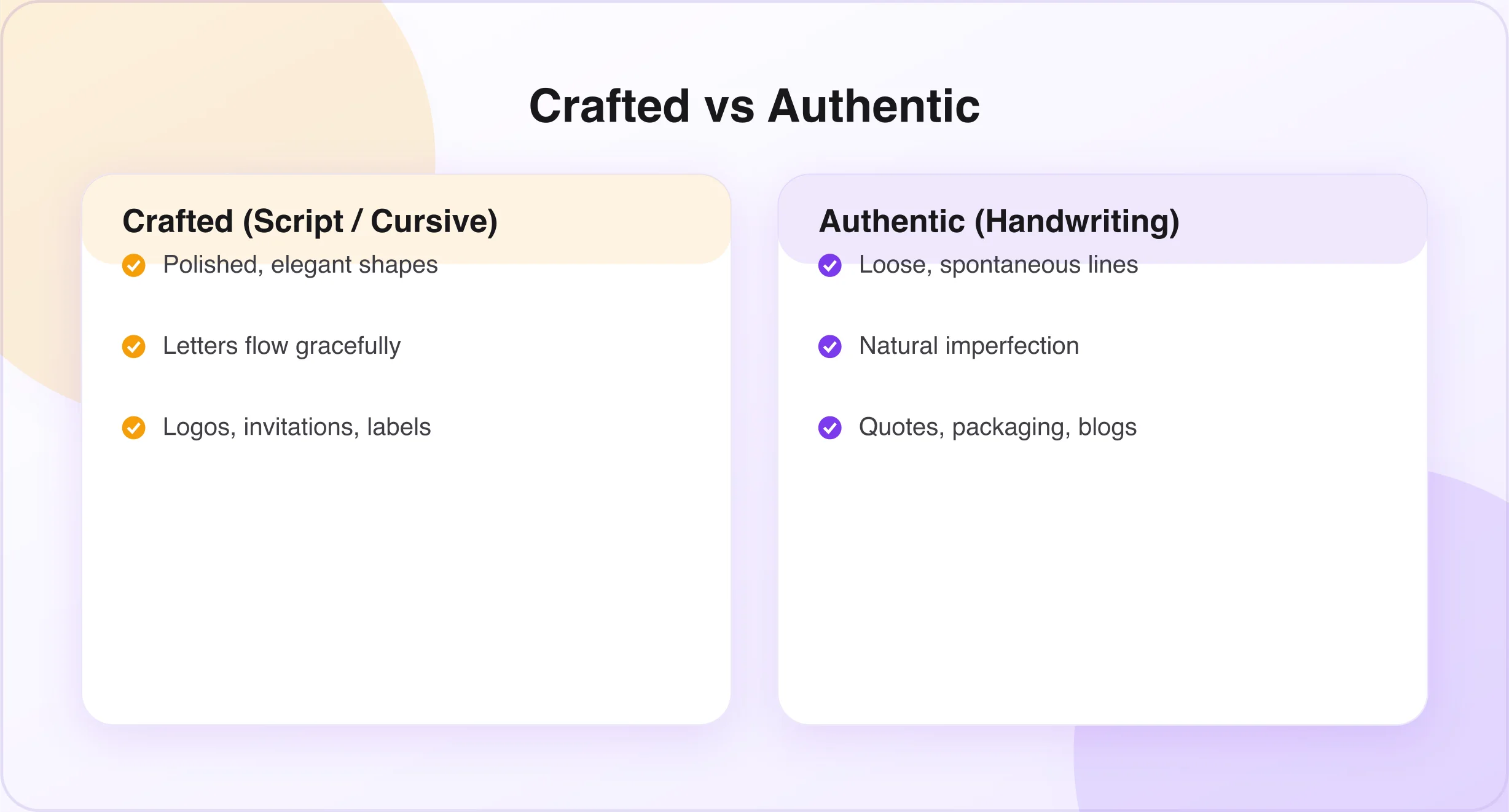
| Script | Cursive | Handwriting | |
|---|---|---|---|
| Category | Broad parent category | Type of script (connected) | Loosest, real-writing feel |
| Letters connect | Sometimes | Always | Often not |
| Overall feel | Elegant, crafted | Flowing, refined | Authentic, imperfect |
| Best for | Logos, invitations, labels | Signatures, bios, cards | Quotes, packaging, blogs |
The one question that settles every choice: ask yourself, do I want this design to look crafted, or authentic? Crafted → choose script or cursive. Authentic → choose a handwriting font. If you land on "crafted," ask: do the letters need to flow together continuously? Yes → cursive. Not necessarily → script.
The Four Most Common Handwritten Font Styles You'll Encounter
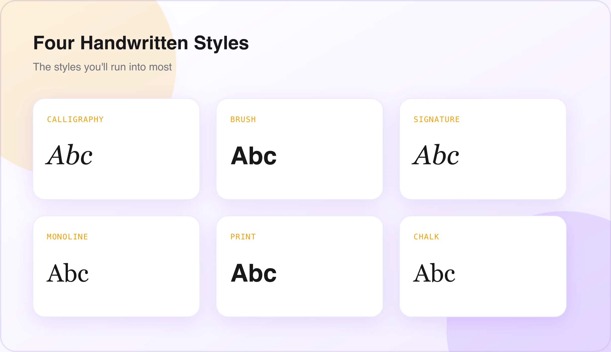
- Calligraphy fonts — the formal art form. Elegant and romantic, often loaded with ligatures and swashy flourishes. Best for luxury wedding invitations, high-end branding, certificates, and fashion editorial headers.
- Brush script fonts — the modern creative choice. Paint-like texture, bold weight, and energetic strokes. Best for street food branding, music posters, skate and surf graphics, and YouTube thumbnails.
- Signature fonts — the personal identity style. Cursive in structure but more personal and individual than calligraphy. Best for personal brand logos, influencer branding, photographer watermarks, and author name typography.
- Monoline script fonts — the clean modern hybrid. Same stroke thickness throughout, cleaner and more contemporary. Best for minimalist branding, digital product design, Etsy shop names, and modern stationery.
Want to explore beyond traditional script? Our small text generator produces delicate superscript and small-caps accents that pair well with any handwriting style above, while the glitch text generator offers a distorted, edgier alternative when a design calls for something more chaotic than calligraphy.
Which Font Type Is Right for Your Project? A Decision Guide
Every font sends a message before anyone reads a single word: formal script signals prestige and ceremony; casual script signals creativity and energy; cursive signals elegance, warmth, and romance; calligraphy signals sophistication and luxury; brush script signals boldness and expression; handwriting signals authenticity and humanity; signature signals personal identity and trust.
The Readability Rule for All Three Styles
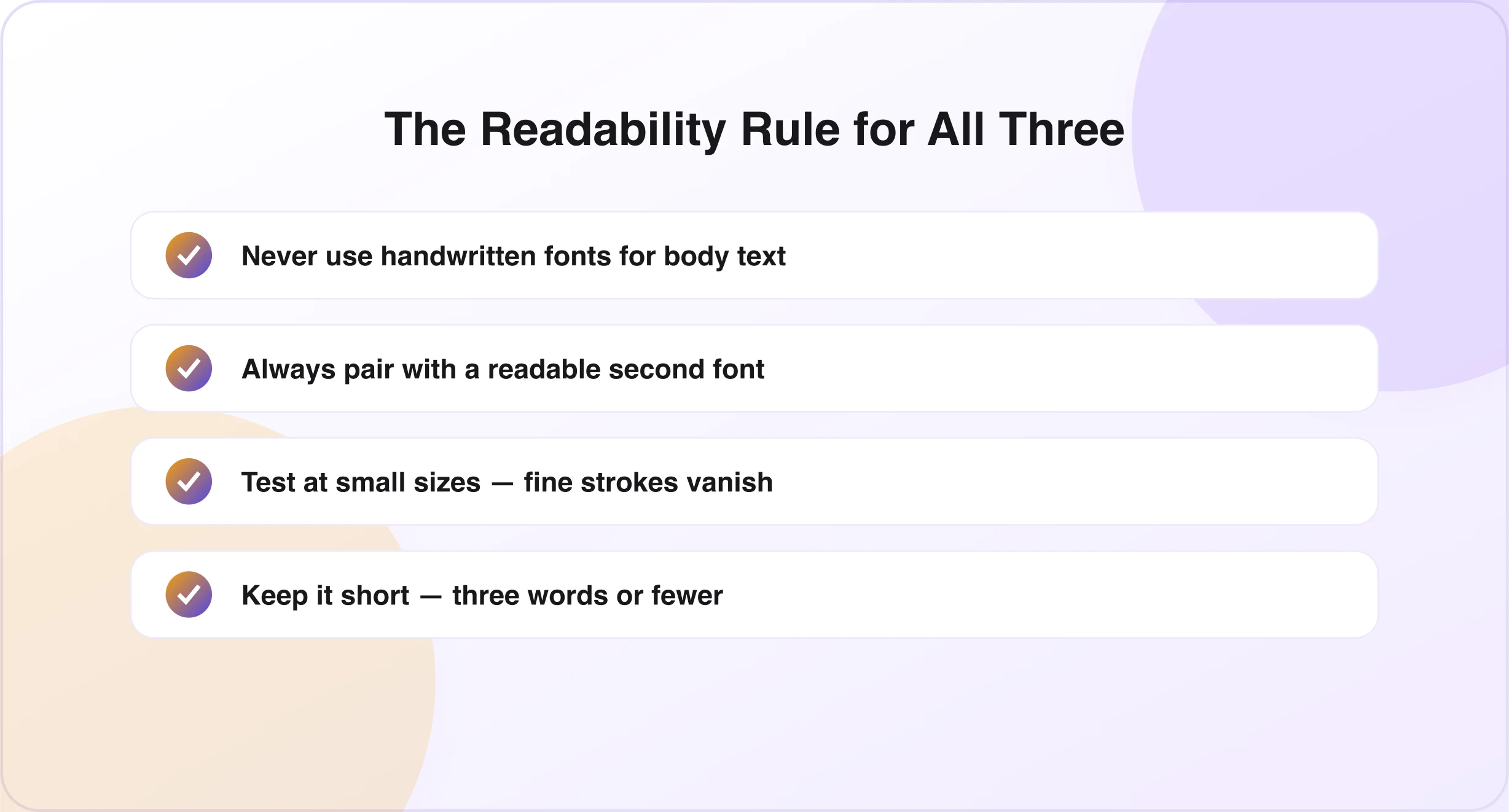
Script and cursive fonts share one weak spot — they're harder to read than standard type. Keep these rules in mind for any handwritten style:
- Never use a handwritten font for body text — readability drops fast.
- Always pair it with a readable secondary font — serif for formal, sans-serif for casual. (See Best Cursive Font Combinations.)
- Test it at small sizes — fine strokes disappear below 14pt in print or 12px on screen.
- Avoid all-caps — most script and cursive fonts weren't designed for it.
- Keep it short — three words or fewer is usually the safe limit for decorative text.
Frequently Asked Questions
Are cursive fonts and script fonts the same thing? No. Cursive fonts are a type of script font where every letter connects in a flowing style. Script is the larger category, and it includes both connected and disconnected styles.
What is the difference between a handwriting font and a script font? Script fonts usually look polished and elegant. Handwriting fonts are built to look natural and casual, closer to real human writing.
Can I use a script font for my logo? Yes. Script fonts are common in logos because they create a stylish, professional look — just make sure the font stays readable at the sizes you'll actually use.
Which is more readable — cursive or script font? Cursive fonts are often easier to read because they follow familiar handwriting patterns. Highly decorative script fonts can be harder to read.
Are calligraphy fonts the same as script fonts? No. Calligraphy fonts are a specific, more decorative type of script font, with stronger stroke variation and more ornate detail.
Conclusion
Cursive, script, and handwriting fonts may look alike at a glance, but each one serves a different purpose. Cursive brings a smooth, elegant feel. Script offers a wide range of creative styles. Handwriting fonts bring a natural, personal touch.
The right choice depends on what you're building. Whether it's a logo, a social post, or a full brand identity, knowing these differences will help you pick a style that matches your message — and stays easy to read. Try generating connected cursive text now with the cursive font generator, or read our guide on how to choose the right cursive font style.

Written & reviewed by
Daragh Boland
Editor & Typography Specialist
Daragh Boland is the editor of Cursive Font Generator, writing about Unicode text, font pairing and stylish fonts across social platforms.
Connect with Daragh on Facebook →