How to Choose the Right Cursive Font Style (2026 Guide)
Picking a cursive font? Learn how to match style, emotion and readability for logos, bios and invitations — with examples and a quick-pick table.
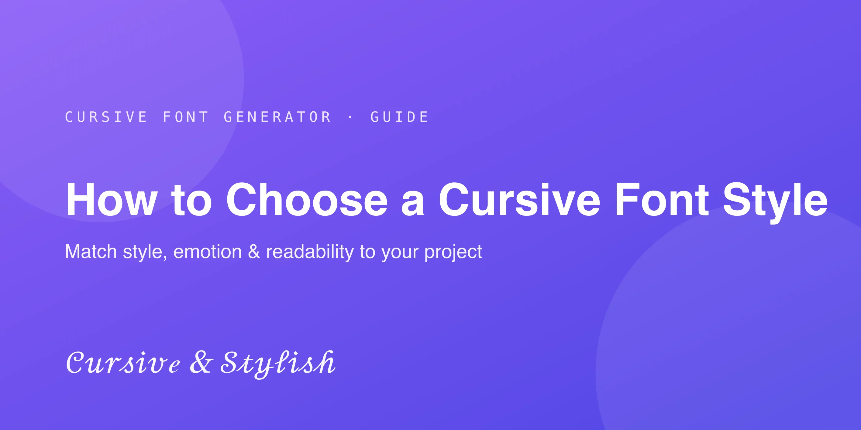
Choosing the right cursive font can make a big difference in how your design looks and feels. The same text can appear elegant, playful, professional, or difficult to read depending on the font style you choose. A font does more than decorate words — it also helps create the first impression.
Different cursive styles can give very different emotions and meanings. Some styles feel modern and stylish, while others feel personal, soft, or formal. In this guide, you'll learn how to choose the right cursive font style, what factors to consider, and common mistakes to avoid. To experiment as you read, keep the free cursive font generator open in another tab. New to Unicode-based text tools? See is a cursive font generator safe to use?
Why Font Choice Matters More Than Most People Think
How Fonts Influence First Impressions
Before anyone reads a single word, the font itself sends a message. A bold, sharp font feels confident and modern, while a flowing cursive font feels personal and elegant. That first impression shapes how the rest of the design is perceived.
Why the Wrong Font Can Hurt a Design
Even a beautifully written message can feel off if the font doesn't match the tone. A highly decorative cursive style on a professional document can look unserious, while a stiff, plain font on a wedding invitation can feel cold and impersonal.
The Relationship Between Style and Message
Every font carries its own personality. Choosing a cursive style that matches your message — whether that's elegance, warmth, or creativity — makes the entire design feel intentional rather than random.
Understanding the Different Types of Cursive Font Styles
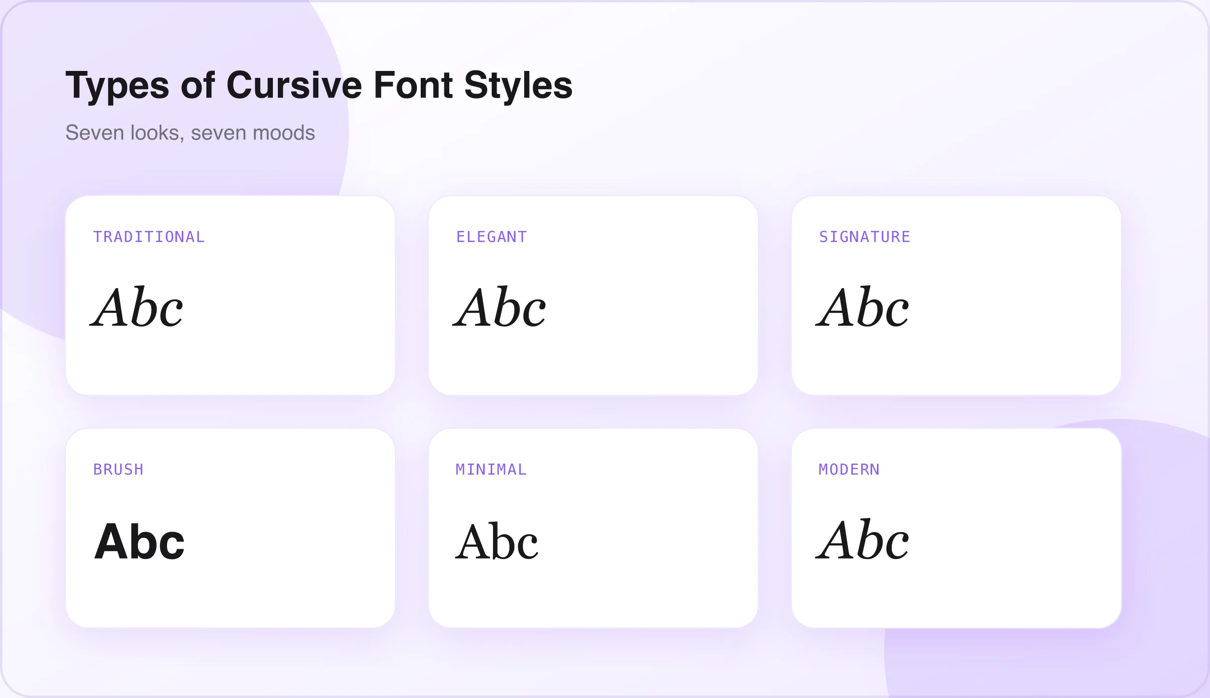
- Traditional cursive — closely modeled after classic handwriting taught in schools; familiar, structured, and easy to read.
- Elegant script — a graceful, flowing style with refined curves, often used to create a sense of sophistication and class.
- Signature-style cursive — designed to resemble a real, personal signature; confident and individual, ideal for logos and personal branding.
- Brush cursive — inspired by brush or paintbrush lettering, with bold, varied strokes that feel energetic and modern.
- Minimal cursive — a clean, simple version of cursive with little to no extra decoration, designed for clarity and easy reading.
- Decorative cursive — highly stylized with extra flourishes and ornamental details; bold and eye-catching but harder to read.
- Modern cursive — a contemporary take that blends flowing letters with cleaner, geometric shapes, fitting current design trends.
If you want to see these looks instantly, the generator's Cursive & Script and calligraphy styles cover most of this range. For something beyond cursive, our glitch text generator turns the same idea toward a distorted, attention-grabbing look using the same copy-paste Unicode approach.
Start With the Purpose of Your Project
- Social media profiles — for bios, captions, and usernames, simple and readable cursive styles work best, since they need to be understood quickly while scrolling. (See our guide to the best cursive fonts for Instagram bios.)
- Logos and branding — signature-style or minimal cursive fonts often work best, since they need to stay recognizable and clear at multiple sizes.
- Invitations and greeting cards — elegant script or soft handwritten cursive styles add warmth and personality to a special occasion.
- Websites and digital content — clean, modern cursive styles perform better, since they must remain legible across different screen sizes.
- Product packaging — brush or handwritten cursive styles give products a more authentic, crafted feel.
Match the Font to the Emotion You Want to Create
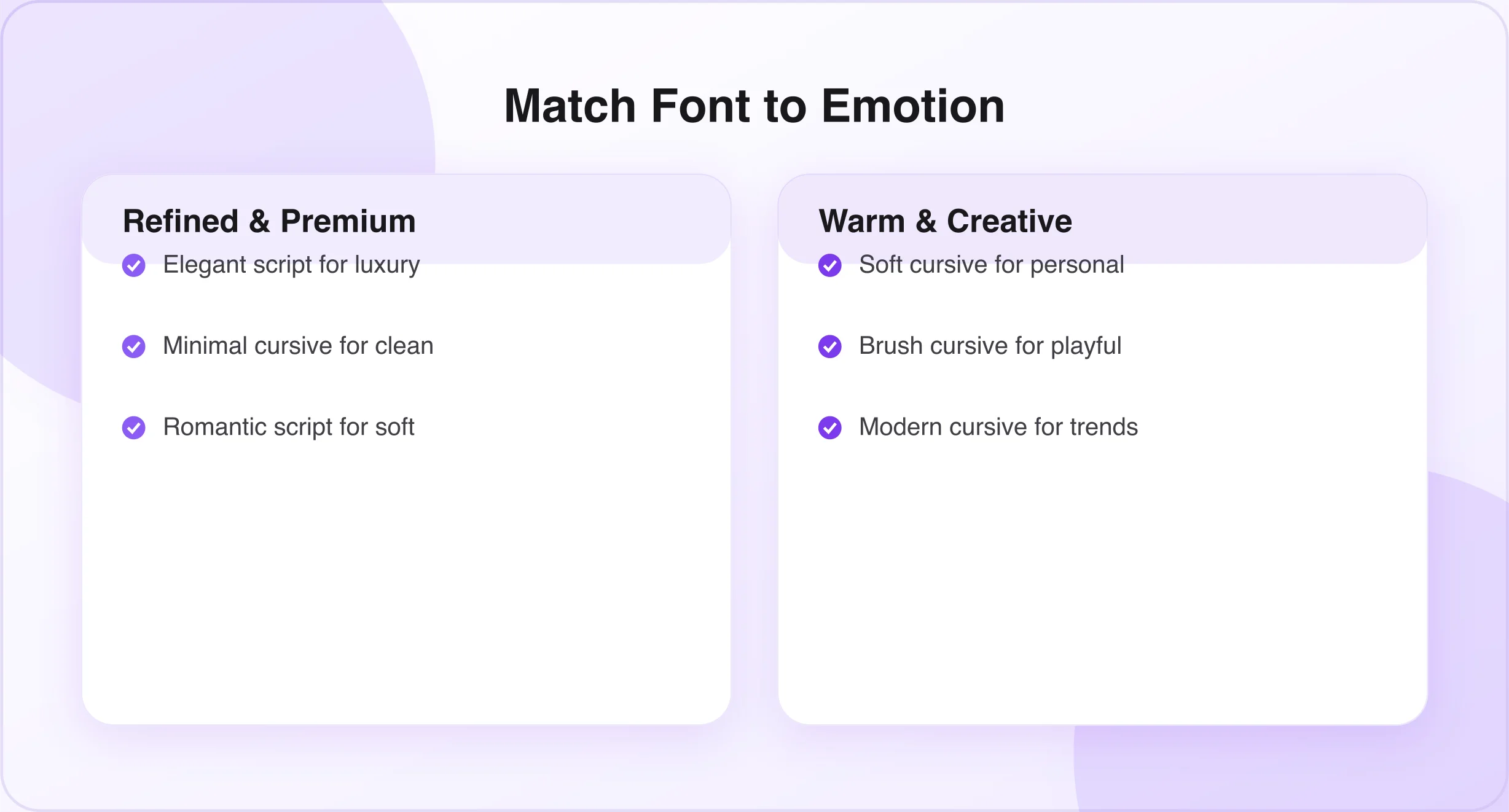
- Elegant and luxury feel — refined script styles with smooth curves and minimal decoration.
- Warm and personal feel — soft, slightly imperfect cursive styles feel more human and approachable.
- Creative and playful feel — bold brush or decorative cursive styles bring energy and personality.
- Professional and clean feel — minimal cursive styles with clear, consistent letterforms.
- Romantic and soft feel — gentle, flowing script styles with delicate curves.
Key Design Elements to Check Before Choosing a Cursive Font
- Letter connection and flow — check whether the letters connect smoothly without awkward gaps or breaks.
- Font weight and thickness — thicker strokes stand out more and stay readable at smaller sizes; thinner strokes feel more delicate.
- Spacing between characters — proper spacing keeps cursive text from looking cramped or overlapping.
- Decorative swashes and flourishes — extra strokes add elegance, but too many quickly reduce readability.
- Uppercase and lowercase appearance — some styles look very different in each case, so check both before finalizing.
Readability: The Rule Most People Ignore
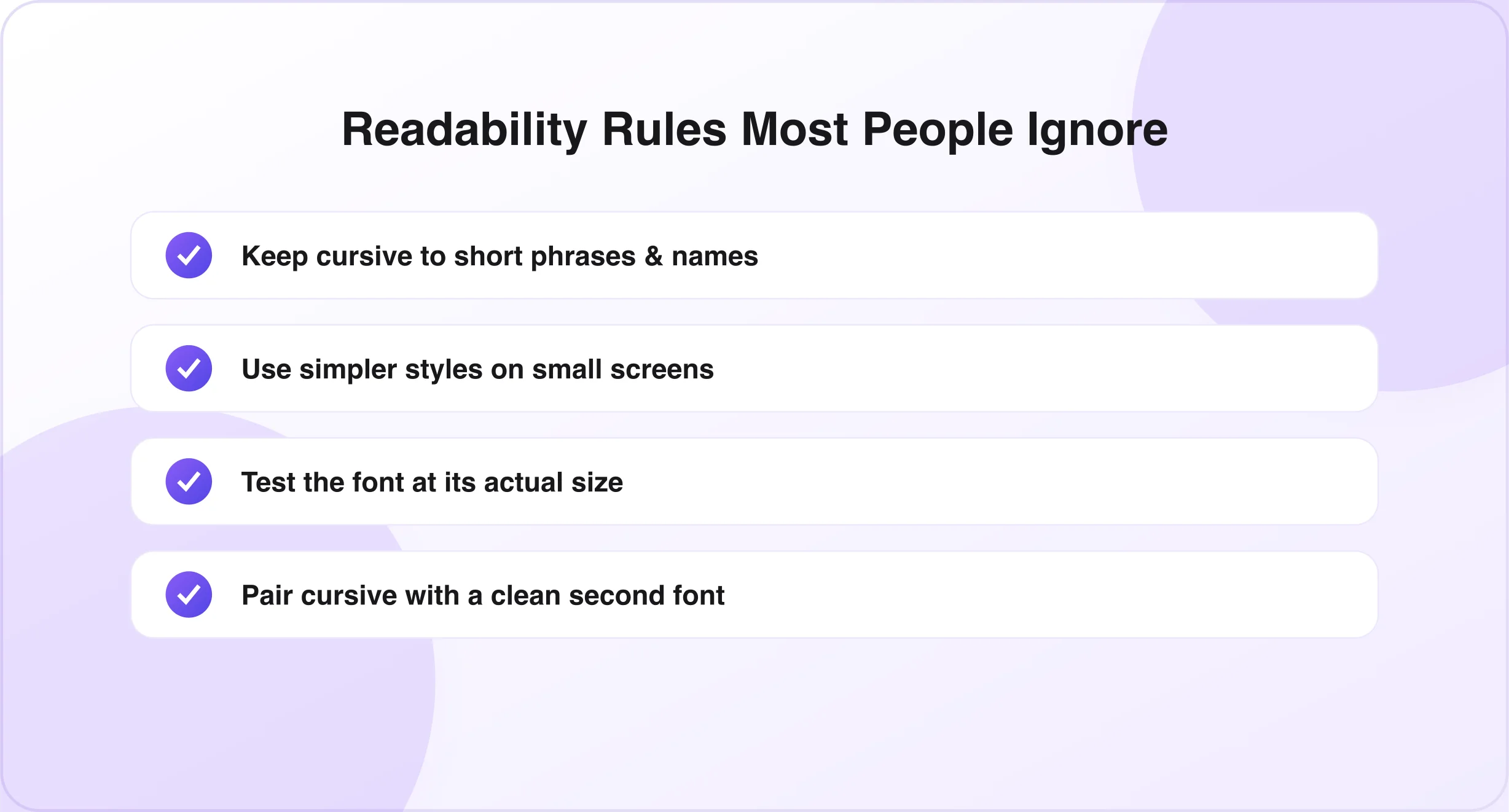
The same decorative details that make a font visually appealing can also make it harder to read quickly, especially in longer text. Cursive fonts generally work best for short phrases, names, or single words rather than full sentences or paragraphs. Simpler, less decorative styles hold up better on small mobile screens, and you should always check how a font looks at the actual size it will be used.
Common Mistakes People Make When Choosing Cursive Fonts
- Choosing style over readability — picking the most decorative option without considering whether it's easy to read.
- Using highly decorative fonts everywhere — the same elaborate style on every piece of text overwhelms a design.
- Ignoring device compatibility — some cursive styles may not display correctly on every device or platform.
- Mixing too many font styles together — combining several cursive styles often looks inconsistent rather than intentional.
- Using cursive for long paragraphs — cursive isn't built for long blocks of text and readability drops sharply.
Quick Font Selection Table
| Project Type | Recommended Cursive Style |
|---|---|
| Social media | Minimal or modern cursive |
| Wedding invitation | Elegant script |
| Business logo | Signature-style cursive |
| Product packaging | Brush or handwritten cursive |
| Greeting card | Soft handwritten cursive |
A Simple 3-Step Formula for Choosing the Right Font

- Define your purpose. Identify exactly where the font will be used — a bio, logo, invitation, or packaging — since this narrows down the best style options immediately.
- Decide the emotion you want. Think about whether you want the design to feel elegant, warm, playful, professional, or romantic, and choose a style that reflects that feeling.
- Test readability before finalizing. View the font at its actual size and in its actual context to confirm it stays clear and easy to read.
Expert Tips for Better Font Choices
- Use one main cursive style throughout a design to keep it feeling cohesive and intentional.
- Pair cursive with clean fonts — combining cursive with a simple, readable font for supporting text balances style with clarity, or try our small text generator for a refined superscript caption underneath. (See Best Cursive Font Combinations.)
- Always preview before publishing in the final context, whether that's a social post, website, or printed card.
- Keep designs simple so the font itself remains the visual focus rather than competing with extra details.
Frequently Asked Questions
How do I know which cursive font fits my design? Start by considering where the font will be used and what emotion you want it to create, then choose a style that matches both the purpose and the tone.
Which cursive font is the most readable? Minimal or traditional cursive styles tend to be the most readable, since they avoid excessive decoration and maintain clear letterforms.
Can I use multiple cursive fonts together? It's generally best to stick with one main cursive style and pair it with a simpler font, since combining multiple cursive styles can look inconsistent.
Are decorative fonts good for logos? Decorative fonts can work for logos in small doses, but confirm they remain legible at different sizes and across platforms.
Which cursive style works best for social media? Minimal or modern cursive styles work best, since they stay clear and easy to read while scrolling quickly through a feed.
Conclusion
Choosing the right cursive font comes down to three key factors: understanding your project's purpose, matching the font to the emotion you want to create, and always prioritizing readability. A beautiful font that no one can read quickly loses its impact, while a well-matched, legible style can elevate even the simplest design.
By following the steps and tips in this guide, you can move beyond simply picking a font that looks nice and start choosing one that genuinely fits your project. Ready to test a few styles? Open the cursive font generator and compare them side by side — or learn the differences between cursive, script, and handwriting fonts.

Written & reviewed by
Daragh Boland
Editor & Typography Specialist
Daragh Boland is the editor of Cursive Font Generator, writing about Unicode text, font pairing and stylish fonts across social platforms.
Connect with Daragh on Facebook →